The Ideas Team

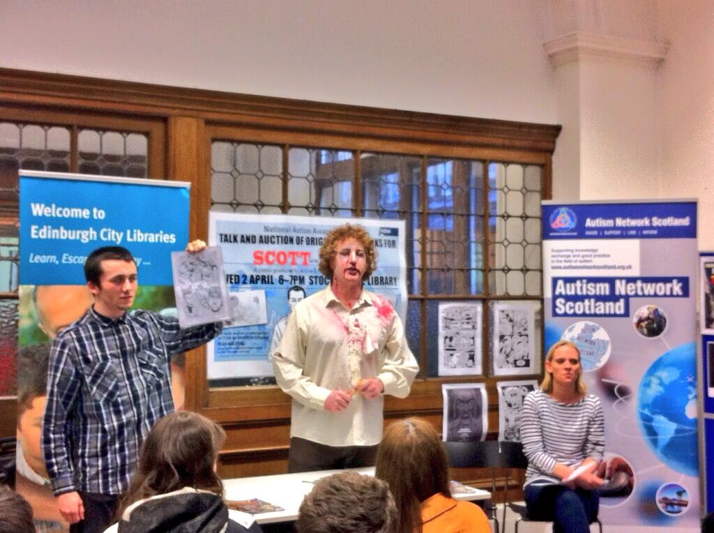
@ArtlinkEdin Scott vs Zombies Auction Fever-the highest bid at £54! Great way to celebrate #WorldAustismAwarnessDay pic.twitter.com/psyRp550qH
— Autism Network (@Autism_Network) April 2, 2014
Wonderful evening @ Stockbridge library,celebrating @WorldAutismDay & publication of Scott v the Zombies @ArtlinkEdin pic.twitter.com/It7RHqqkdO — Rosemary Kaye (@RosemaryKaye1) April 2, 2014

Come along and hear Alan Grant, famous for his work on 2000AD and Batman, Scott and Liz Davidson, talk about their new comic – Scott vs Zombies on the 2nd of April at 6-7pm, Stockbridge Library, 11 Hamilton Place, Edinburgh, EH3 5BA.
As part of National Autism Awareness Day we will be auctioning some of original signed artworks by artist Robin Smith (2000AD and The Bogeyman). All proceeds go to work with people with autism. Preview the artworks HERE.
If you can not attend the evening event you can also put in a postal bid. Simply download the form HERE and email a signed copy to Vanessa Cameron, info@artlinkedinburgh.co.uk . Bids received before 4pm on Wednesday 2nd April will be registered.
Let us know you are coming! Book HERE.
Comics will be available for sale at the event or if you can’t make it – buy one now!
For more information please contact us on 0131 229 3555
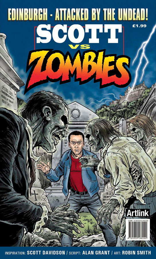
Alan Grant famous for his work on 2000AD and Batman and Scott Davidson, a young man who has autism and the inspiration behind Scott vs Zombies, created this wonderful new limited edition Comic drawn by Robin Smith.
We are really pleased that Scott vs Zombies has just been selected as one of the Top 10 Teen Books that offer different perspectives on autism by the Scottish Book Trust – a much deserved accolade!
For your copy please contact us on 0131 229 3555 or email us at: info@artlinkedinburgh.co.uk
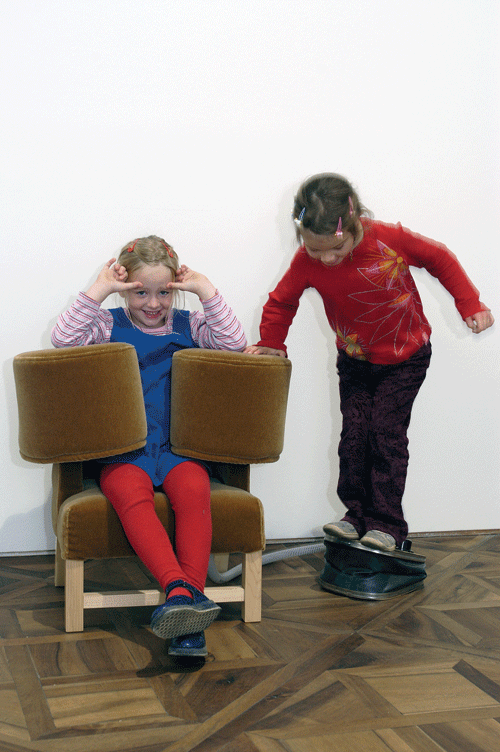
Artist Wendy Jacob, the creator of the Squeeze Chair* with Temple Grandin is coming to Midlothian to work staff from the Cherry Road Day Centre at the beginning of March. She will be working with people with profound learning disabilities looking at the idea of ‘fascinations’ , what holds an individual’s attention, acts as a focus for them. For two weeks she will work at the centre, as part of Artlink Ideas Teams, watching and learning.
Wendy Jacob is an artist whose work bridges traditions of sculpture, invention and design, and explores relationships between architecture and perceptual experience. Recent projects have involved collaboration with architects, engineers, circus performers, and working with deaf and autistic individuals. Wendy has previously worked with Centre for Advanced Visual Studies, MIT, Cambridge, USA – http://wendyjacob.net/.
*The Squeeze Chair project consisted of a series of upholstered chairs with arms that inflate to hold the sitter in a firm hug. The project grew out of meetings between Jacob and Temple Grandin, an animal scientist and engineer, who designed a “squeeze machine” to apply even pressure to her own body. Grandin is autistic and like many with autism, she is especially receptive to the calming effects of pressure.
This year we decided to look more closely at Artlink’s aims, in the form of a manifesto.
…
For more Annual Reviews please look here.
…
This publication is also available in Braille, Tape and Large print formats.
Please contact us for your copy.
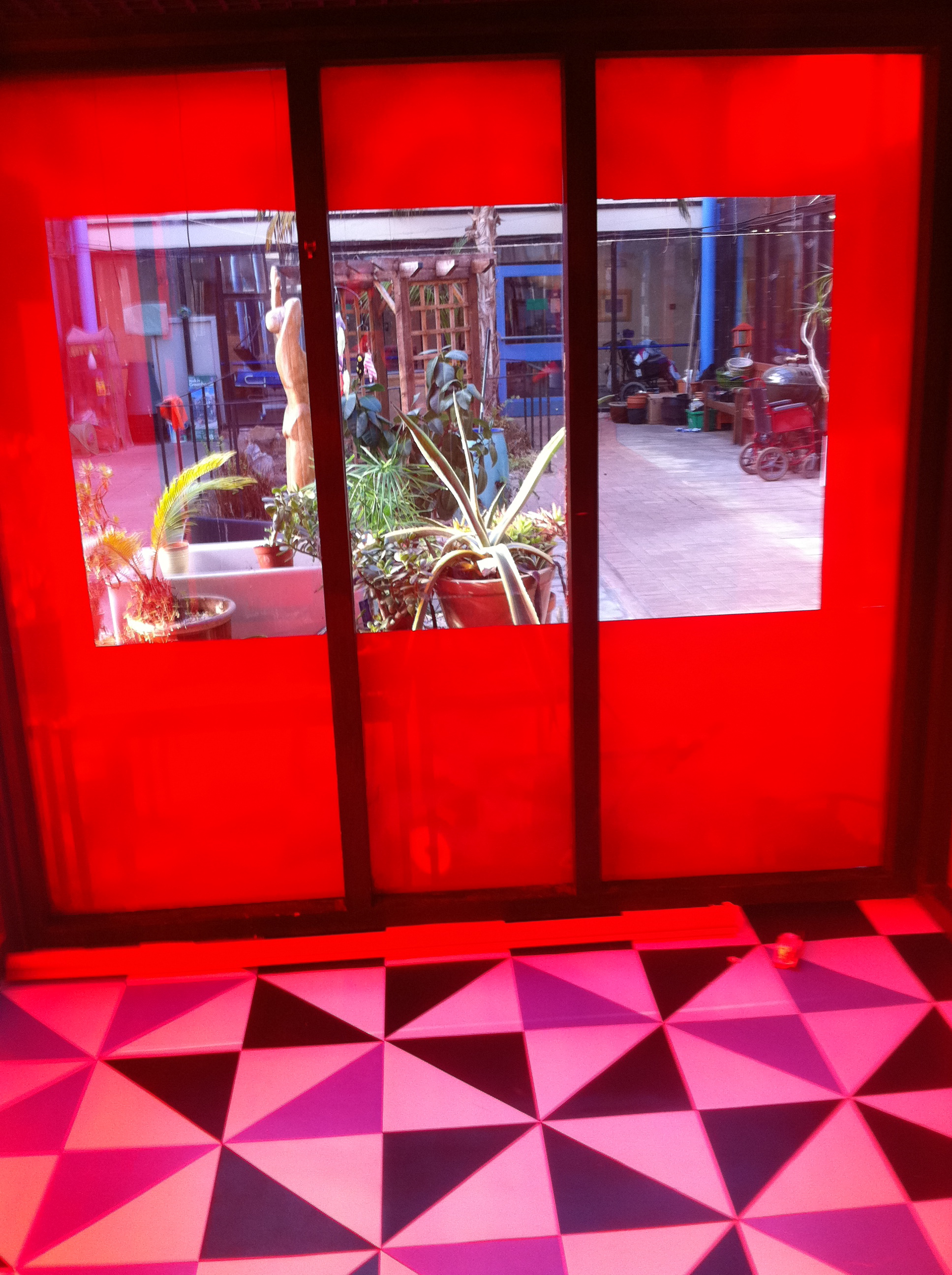
Artist Steve Hollingsworth writes:
Laura and I were working today on changing a former smoking room at the care centre we’re working in, into a much more useable sensory space. All the walls are glass and it gets a great deal of light, Laura ordered some red gel and we placed this on glass on all the walls. When it’s bright the entire room is bathed in a warm orange/ red glow. We also re-floored the space using tiles in a pseudo Juan Munos fashion. It looks very geometric and bold, hopefully people with reduced vision will be able to perceive the floor as there is a lot of contrast between black and white. We left an aperture so anybody inside can look through to the conservatory space (we have big plans for this space too..) We also bought a big red blind so the space can be entirely red without any other visual distraction. The extreme red-ness of the space really has an effect on vision, on emerging from the space other colours such as blue and green took on a new aspect. We want this space to be spare and clutter free, so people can go in there and just relax or engage in one sensory activity at a time. We also plan to finish off the space by installing some coloured neon to play with the light further, perhaps circles of red green and blue, again re-inforcing notions of being bathed in colour. I guess the space hints toward artists like James Turrell who uses colour and light to show ourselves seeing and how perception is easily fooled.
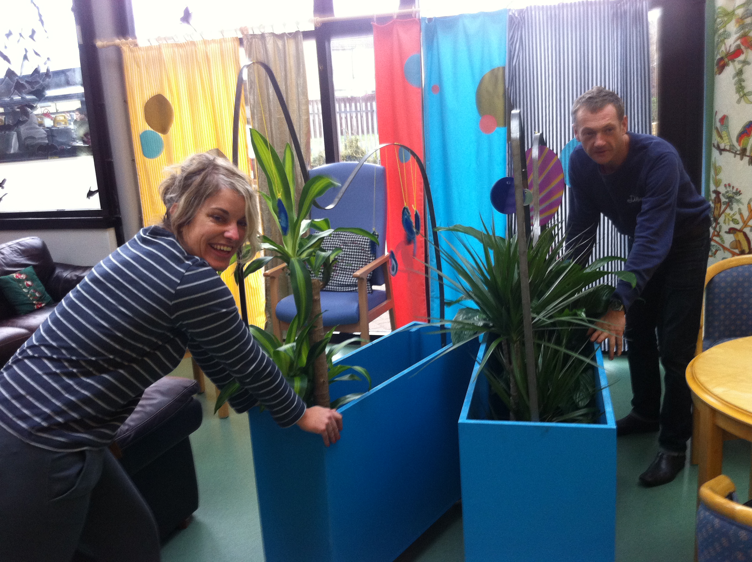
Steve and I have been working hard to get the wheeled walls I mentioned in a previous post into being. We were bending metal on this machine from another dimension it took some serious elbow grease, but we got it done in the end. The idea is that they will house a series of climbing plants and interesting sensory delights. We want them to be used by service users and staff, visitors and other life forms to create walls where needed in the large communal area. The will never be the same from day to day, as they will be growing and reflecting what is happening in the center. But what to call them? I affectionately call them wheely-wallys, but think they need something more informative and directional – can anyone suggest something?……. Laura Aldridge
This year’s Annual Review is written by guest writer Nicola Wright who explores the challenges posed by low expectations and cuts in services.
This publication is also available in Braille, Tape and Large print formats.
Please contact us for your copy.
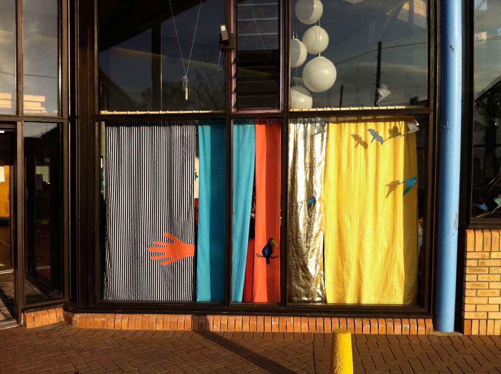
What can you do with a space that has become like a waiting room for a doctor’s surgery? How can you make it an engaging space for individuals to not just spend time waiting for their next activity, but to experience and learn and experiment with. This is what artist Steve Hollingsworth and myself (Laura Aldridge) have been steadily working on over the last few months at a day centre for people with learning difficulties. We started talking to everyone at the centre, finding out what people liked and didn’t like – what they would like to see happen. The we begun by making simple changes – drawing focus to certain parts of the room, making zones and furnishing the space in a way that service users can change and direct the space – A wall of curtains to be drawn, and opened – wheeled walls, containing plants, chimes, crystals, mirrors, precious stones – that can be configured into different arrangements depending on who is in the space. All this happened within the space – we set up a work area and made everything in the space, so that whatever we were doing was informed by the people and architecture of the building. The space need never be the same from day-to-day, and is constantly evolving. This excites us and hopefully those using the space too.